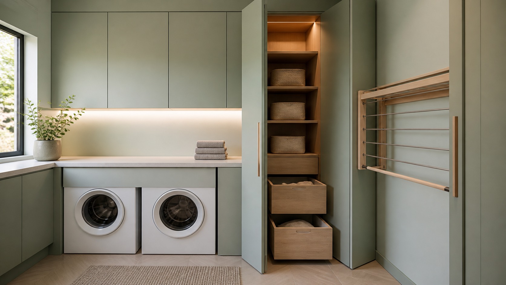
A Fresh Palette Begins With the Colors Already in the Room
Laundry room color is often chosen as if the walls were an isolated canvas, yet the room already contains powerful color blocks: white or dark appliances, stainless doors, a floor that may continue from the hall, a countertop, cabinet interiors, and the light itself. A fresh modern palette coordinates those fixed elements instead of fighting them. It may brighten a windowless room with a nuanced warm white, give ordinary white machines definition through soft blue cabinetry, or use an earthy floor to keep pale surfaces from feeling sterile. The result does not depend on following a single trend. It comes from undertones that agree, contrast placed where it clarifies the architecture, and finishes that remain practical around moisture and lint. Large samples and real-room observation matter more than a tiny paint chip. By assigning every hue a role—background, anchor, bridge, or accent—the room can feel updated while staying coherent with the rest of the home.
A: A coherent light-to-midtone palette with even lighting usually helps more than stark white alone.
A: Soft blue, sage, warm gray, wood, and charcoal can all work when their undertones coordinate with surrounding finishes.
A: Yes selectively, provided ambient and task lighting are strong, even, and carefully placed.
A: Matching can simplify a compact room, while a related cleaner trim color provides gentle definition.
A: A background, anchor, bridge material, and restrained accent are usually sufficient, though surfaces may vary within families.
A: Its undertone becomes visible beside fixed materials and under the room's particular light sources.
A: Muted sage, olive-gray, and eucalyptus remain versatile because they bridge natural wood and common appliance finishes.
A: Keep major vertical surfaces restrained and borrow a secondary neutral from the flooring.
A: No. They should relate to the palette while remaining useful objects that can change over time.
A: After large samples have been observed beside fixed finishes in daylight and evening artificial light.
Inventory Fixed Finishes Before Building a Palette
List every surface that will remain: appliances, floor, counter, backsplash, sink, faucet, doors, and adjacent hallway materials. Describe their undertones rather than relying on broad names. One white appliance may lean blue, another creamy; a gray floor may contain green or violet; a quartz sample may read warm beside stainless steel.
Place samples directly against these materials. A cabinet color selected from memory can shift when surrounded by a large white machine face. If appliances will be replaced later, choose a palette with enough flexibility to accept common white, dark, or metal finishes.
Use Warm White to Create Soft Continuity
Warm white suits rooms that need brightness without a clinical cast. It can connect natural wood, beige stone, brass, and cream textiles while allowing white appliances to appear crisp rather than mismatched. The correct warmth is subtle; a heavily yellow white may look dated under cool utility lighting.
Compare wall and trim whites together. Using the same hue in different approved finishes can simplify a small room, while a slightly cleaner trim color can define doors and casing. Confirm that ceiling paint does not introduce an unrelated cool band overhead.
Texture prevents an all-light palette from flattening. Matte cabinetry, softly veined counter material, woven baskets, and restrained wood details create depth without adding more hues. Shadows then become part of the composition.
Try Soft Blue for Clean Energy
Dusty blue, mineral blue, and muted denim bring a sense of water and air without turning the room into a theme. They work particularly well on cabinets because the color forms a clear volume beneath pale counters. Pair blue with warm white walls or light wood to keep it welcoming. Gray-heavy blues can become cold in a north-facing room, so test them throughout the day.
Choose Green for a Grounded Modern Room
Sage, olive-gray, and eucalyptus tones bridge cool appliances and warm natural materials. A pale green wall can function almost like a neutral, while deeper green base cabinets create weight beneath white uppers. Greens with yellow undertones often relate comfortably to oak and brass; bluer greens may pair better with nickel and cooler stone.
Avoid repeating the same green at several almost-matching strengths unless the variation is deliberate. One principal green, one neutral, and natural texture usually read more clearly. Plants can echo the family, but they should not be used to correct a palette that is already too saturated.
Bring in Earth Tones Through Surfaces
Clay, sand, mushroom, and muted terracotta add warmth that can withstand changing trends when used as material-like colors. A terracotta-look floor, putty wall, or clay-painted cabinet island provides an anchor for cream, charcoal, and wood. These hues are especially useful in rooms connected to mudrooms or informal entries.
Balance earth tones with enough light reflection. A small room with limited daylight can feel dense if floor, cabinets, and walls are all midtone. Keep one broad plane pale and use the richer color on a lower or more durable surface.
Check grout and caulk colors as part of the palette. Bright white joints can outline warm tile too sharply; a related neutral may produce a calmer field while still meeting maintenance needs.
Use Charcoal or Near-Black as an Anchor
Dark color can make white appliances look intentional and give a utility wall visual depth. Charcoal base cabinets, a black drying rail, or a deep painted niche may be enough. Full dark rooms require strong, even lighting and careful attention to lint, water spots, and fingerprints.
Near-black hues often contain blue, green, or brown undertones. Coordinate that bias with the floor and counter rather than treating black as automatically neutral. Matte finishes reduce glare but may show handling differently from satin surfaces, so test cleanability.
Separate Cabinet Color From Wall Color
Cabinetry can carry stronger color because it is divided by doors, counters, and hardware. Walls usually occupy a larger continuous field and influence skin tone and fabric color under artificial light. A saturated cabinet paired with a quieter wall lets the architecture remain legible.
For a low-contrast scheme, vary value more than hue. Pale blue-gray walls with deeper slate-blue cabinets create depth while staying within one family. For stronger contrast, ensure a bridging element—counter veining, floor tone, or hardware—connects the two.
Do not select cabinet and wall samples independently from separate inspiration images. Assemble them on one board with the actual counter, backsplash, floor, and appliance reference so undertone conflicts become visible early.
Let the Floor Carry Durable Color
Floor color can establish the room before cabinets are seen. Patterned porcelain, muted brick tones, or resilient flooring with natural variation hides small lint and everyday marks better than a perfectly uniform dark plane. Verify slip resistance, water suitability, care requirements, and continuity at adjacent thresholds.
A colorful floor generally benefits from restrained walls and cabinet fronts. Pull one secondary neutral from the flooring rather than matching its strongest hue. This creates connection without making the room feel coordinated as a set.
Build an Accent Strategy With Real Objects
Accent colors are most convincing when they arrive through useful items: a drying rail, washable runner, carry basket, or towel. Choose one small family and repeat it sparingly. A muted rust towel might relate to terracotta flooring; a black rail can echo appliance doors and hardware.
Avoid designing the permanent room around bottles and packaging that will change. Detergent labels introduce temporary colors, so the base palette should tolerate some visual noise. Closed storage can reduce that competition without requiring products to be decanted.
If art is appropriate in a dry zone, select it after the functional palette is complete. Protect it from humidity and avoid pieces with text or themes that make the room feel overly literal. The architecture should carry the room even when accessories are removed.
Correct Windowless Rooms With Light, Not White Alone
Painting a dark room brilliant white does not create daylight; it may emphasize gray shadows. Improve ambient and task lighting first, then choose a light color that remains pleasant under those fixtures. Warm ivory, pale mushroom, or a controlled light blue-green can feel more intentional than a stark white.
Use high color-rendering light sources where sorting stains and fabric colors matters. Keep color temperature consistent across ceiling and under-cabinet fixtures. Mixed warm and cool sources can make paint appear patchy even when application is uniform.
Test Large Samples Through a Full Laundry Day
Paint sizable movable boards or use manufacturer samples large enough to show undertone. Place them vertically on different walls, beside the machines, and under upper cabinets. Observe morning, afternoon, and evening light, including the fixtures used when most laundry occurs.
View cabinet and floor samples horizontally as they will be installed. A color seen flat on a table receives light differently from a vertical door. Add white fabric, dark clothing, and a typical basket to see how ordinary contents affect the room.
Keep notes rather than relying on memory. Eliminate colors that turn muddy, fluorescent, or disconnected at any important time. The final selection should remain convincing under the room’s least flattering light, not only in one sunny moment.
Carry the Palette Beyond the Laundry Door
A laundry room can be expressive without feeling detached from the house. Borrow an undertone, wood species, metal finish, or trim color from adjacent spaces. The room may use a stronger version of a nearby hue while retaining a recognizable connection.
Freshness comes from clarity, not novelty. A palette of powdery blue cabinets, warm ivory walls, cream counters, and a quiet terracotta floor can feel current because each surface has a role. The same is true of sage with oak, charcoal with soft white, or mushroom with black accents. Coordinate fixed materials, test under real light, and keep accents subordinate; the updated look will last beyond a single color forecast.
Use Two-Tone Cabinets to Clarify the Layout
Two-tone cabinetry is most successful when the color break explains the room. Deep lower cabinets can ground a long counter while light uppers recede; a wood tall cabinet can identify household storage beside painted laundry units; or a contrasting sink base can mark the wet zone. Avoid switching colors at every door or using contrast to compensate for irregular cabinet sizes. Assign each finish to a complete volume and repeat a connecting undertone in the counter, floor, or hardware. If the room is small, keep the higher or larger field quieter so the composition does not become top-heavy. Draw the elevation in color before ordering because a finish ratio that sounds balanced may look very different once appliance openings interrupt it.
Plan Color for Wear and Future Touch-Ups
Color and durability are inseparable in a working room. Very dark flat finishes may reveal lint or burnish where hands repeatedly touch them, while highly glossy pale surfaces can emphasize dents and uneven walls. Review cleaning instructions and test a sample with the mild products likely to be used. Around sinks and sorting counters, a scrubbable surface is worth more than a perfect catalog color that cannot tolerate routine wiping.
Keep exact manufacturer names, codes, formulas, sheen, and purchase dates in the project file. Paint formulas can vary across product lines, and cabinet touch-up materials may age differently from the installed finish. Store only products that remain safe and usable, and follow disposal guidance for leftovers. A labeled sample board can be more reliable than an old open can when future matching is needed.
Expect light and materials to change slowly. Wood warms, some whites shift beside it, and daylight conditions vary with seasons and window coverings. A robust palette accommodates that movement because its undertones relate rather than match with laboratory precision. Select colors as a family, give the strongest hue a clear architectural role, and protect the finishes according to their use. The room will continue to feel fresh because the composition remains understandable even as individual surfaces develop a natural patina.
A final photograph with a neutral reference object can document how the installed colors originally related, providing useful context when bulbs, appliances, or adjacent finishes change years later. Before purchasing full quantities, confirm the approved samples against the final lighting specification, since a late fixture substitution can alter undertones across every carefully coordinated surface.